Guggenheim Rebrand
Rebranding & Identity
*Not affiliated with Guggenheim, for educational purposes
Rebranding & Identity
*Not affiliated with Guggenheim, for educational purposes
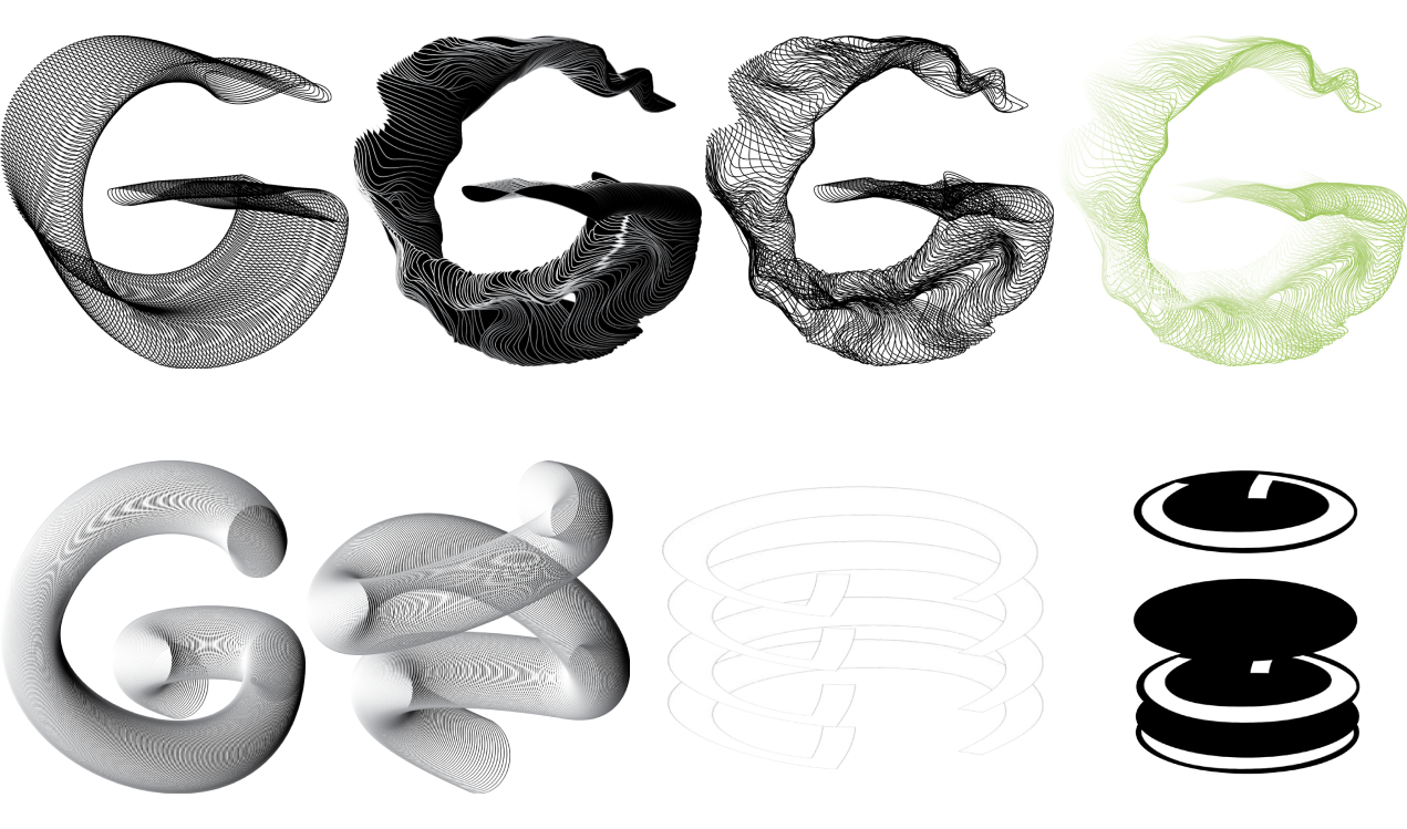
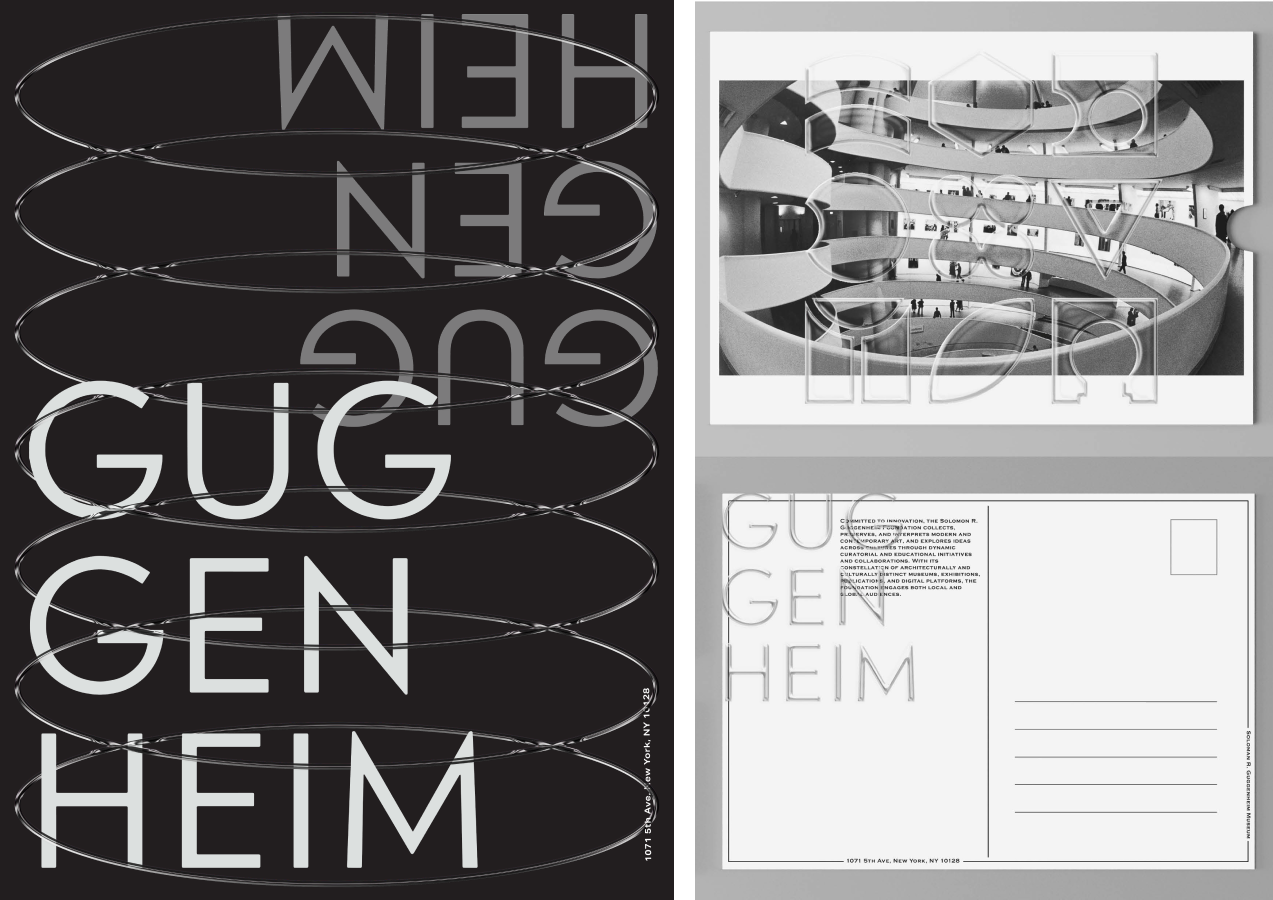
The Guggenheim is an established art museum in New York City, widely known for its unique architecture by Frank Lloyd Wright. The rebrand focuses on the spiral architecture through circular 3D assets and incorporates contemporary elements including transparency.
The rebrand blends the historical components of the institution's architecture, artwork, and identity, with these added elements representing the growth of our ever-changing culture and art. The transparency also represents the museum's position as an individual identity and its purpose to shine a light on the artists showcased in collaboration with the museum.
The rebrand blends the historical components of the institution's architecture, artwork, and identity, with these added elements representing the growth of our ever-changing culture and art. The transparency also represents the museum's position as an individual identity and its purpose to shine a light on the artists showcased in collaboration with the museum.
Preliminary Research
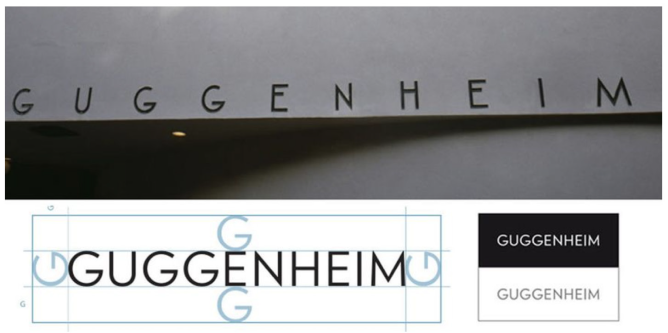
While looking at the Guggenheim identity and brand (as of 2020), the main elements used were the black and white palette, the all-caps logo of “Guggenheim,” and flat graphic designs. Initial sketches focus on expanding the identity from the simple and straightforward approach to a more dynamic identity that incorporated spiral movement and utilized space (xyz axis).
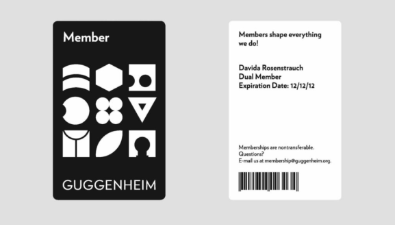
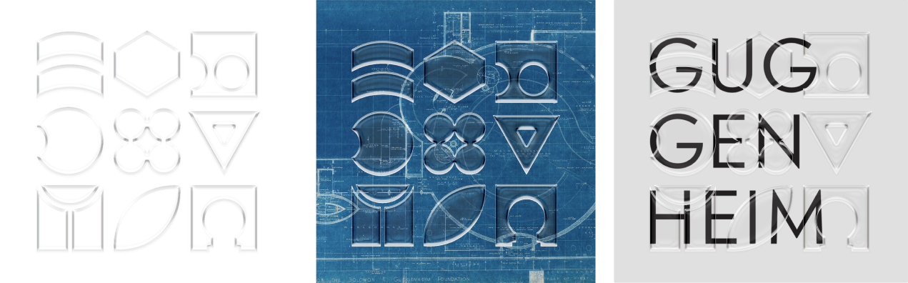
Upon research, the member cards utilizing symbols inspired by different cutouts appeared, however, used minimally throughout the museum’s branding. This element would be used as a focal point as identifiable symbols to represent the Guggenheim, with the applied 3D transparent components.
Upon research, the member cards utilizing symbols inspired by different cutouts appeared, however, used minimally throughout the museum’s branding. This element would be used as a focal point as identifiable symbols to represent the Guggenheim, with the applied 3D transparent components.